Theme Editor
CRUD CoreTheme
An existing CoreTheme can easily be renamed in the ThemeEditor via the ContentHeader.
If there's a need to save a current theme as a checkpoint, for instance, to create a backup copy, a copy of the current CoreTheme can be saved under a new name using the "save as" option.
CRUD SubTheme
Also through the ContentHeader, a new SubTheme can be created. This can be based on an already existing SubTheme, but if no base is selected, it will always be initialized with default values. The only requirement is a unique name, as it serves as the identifier.
In addition to editing its internal values, the name itself can be changed and determined. The same premise applies here as with the creation of a SubTheme, which is the uniqueness of the name.
To remove erroneous SubThemes or delete obsolete data, a delete functionality is also provided.
ContentHeader
A central component of the ThemeEditor is the ContentHeader. It houses numerous essential functionalities and is the core of the editor.

Thus, it enables the control of CRUD operations on Core- and SubThemes, as well as the ability to undo or redo actions.
Paletts
The CorePalettes are color palettes that are part of a SubTheme. An unlimited number of palettes can be created, each of which, in turn, can consist of an unlimited number of color tokens.

The palettes offer the possibility to store recurring or essential colors and create references to them. These references can then be used in numerous places and influence the design of the application.
The significant advantage of these references is that a change in the value of the colors in a palette automatically updates the value of the countless references, significantly reducing the workload.
CoreTokens
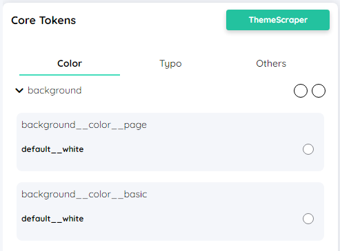
The CoreTokens determine the fundamental appearance of my application. They influence the style of the control elements and are thus an essential component of a theme.

When the CoreTokens are altered, my control elements also change, provided that no specific value has been explicitly set via the ComponentTokens or the specific config.
For better clarity, the core tokens are grouped by types and categorized into the three categories Color, Typo and Others.
Inside these Categories, one can find properties like:
Component Overview
To immediately visualize stylistic changes, the Theme Editor includes an overview of all components and their appearance. The view can be directly filtered, allowing for individual adjustments.
- Filter by components
The view can be pre-filtered to specific component types, creating a better overview. - Filter by state
In addition to the type of component, the particular state is also filterable. For instance, if only the hover state of components is to be altered, the view can be filtered accordingly. - Filter by search text
In addition to filtering by component type, this can also be done through search, where both filtering methods are not mutually exclusive.
ComponentTokens
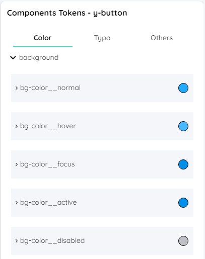
An essential part of theming in yeet are the ComponentTokens. The individual components of the application are influenced in their visual appearance by these tokens. For example, ComponentTokens are used to determine the background color of a yButton.

When the value of a token is changed, it affects all components of the same type, provided the value has not been explicitly overridden in the configuration.
When changing the appearance of a certain component type, you can select between choosing a CoreToken, a CustomToken and an individual value.
Similar to the CoreTokens, the ComponentTokens are also categorized into Color, Typo and Other for the same reason.